

Hey folks!
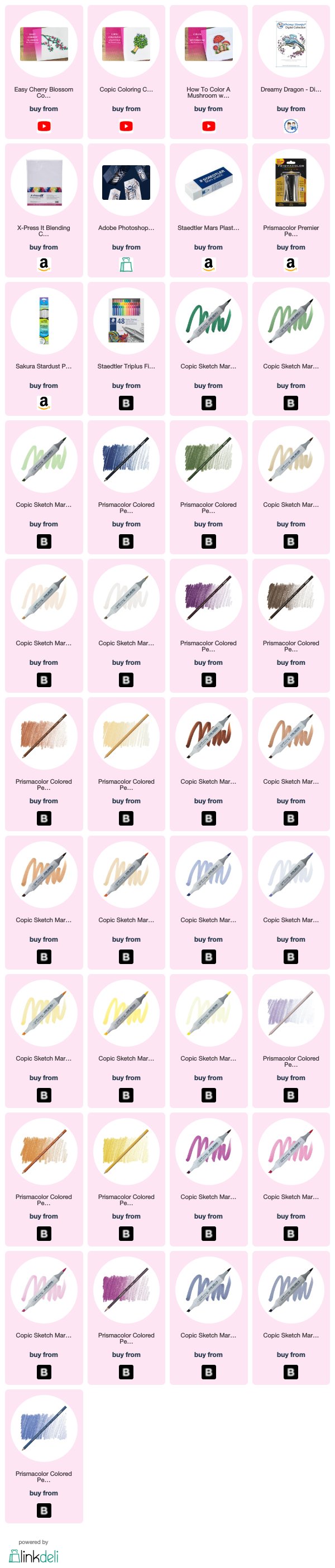
I know fantasy images aren’t everyones cup of tea, but today's image is great for practicing simple texture and if you’re feeling braver than what this lil guy surely is, you can give him even more character by adding an easy detail to the wing! With or without the added details, this is a really fun image for Copic’s and colored pencils! In today’s video I’m sharing Whimsy Stamps, take on a dragon. This digital stamp is called DREAMY DRAGON.

Some historians believe that dragons may have actually been prehistoric crocodiles. No one is absolutely certain where the idea of dragons actually came from though. No matter, just like humans dragons have a culture of their own. In this culture, they've been DEPICTED in many different forms. Including those with their own personalities and intellect.
Since DREAMY Dragon was snoozing on branch, I thought it would be perfect to go with the green and brown color palette that's typical of the EARTH dragon. I used G29, G46, and G43 which is a fairly bright color combination in the green family, but he's a dragon so whether you go with brighter colors or more muted it works just fine!

I printed this image at 150% of the default size on X-Press It BLENDING card. There are couple of factors that are super important if you print this large folks. First, make sure that you are using quality Copic friendly paper. The branch, dragon and background need special attention. Areas with this much white space need a good paper that works with your ink. If you don't, your blending will suffer and it will show.
Also, make sure that your markers have plenty of ink. If you can't get enough ink onto that paper, you can't get a good blend and it will show. I talk in the VIDEO about skipping the stippling if you want, but either way plenty of ink is key. Not enough ink without stippling means poor blending that will show. Not enough ink and stippling means he'll have chicken pox not texture.

Our guy is the hero in this image and you really want him to take center stage. However you still want the rest of the image to look cohesive. For this reason, I chose the brighter pops of yellow and red-violet in the flowers. Also since I added some stippling on his body with a Sakura STARDUST Pen, I spread that out to the rest of the image by adding it to the lil green floaty's around him as well.
That's it!
Want all the deets? You can get them in the full length, real time video on PATREON! Your support means a ton and helps support my free content here on my blog and on my YOUTUBE Channel.
I hope you enjoyed my project today! DISCOVER more projects on my Youtube Channel. Do be sure to subscribe if you haven't and also tap that notification bell so you don't miss any future videos. As always Thanks So Much for stopping by!
Until next time.
If you're interested in any of the products I've used, I have links (some affiliate links) throughout and at the end of the post. Click HERE to read my full disclosure policy.
Become a Patron!


Post a Comment