Hey folks!
I had loads of fun making the cards I'm here to share with you today! I had the chance to use quite a few new (to me) goodies on these cards and it was fab.
If you're interested in any of the products I've used, I have links (some affiliate links) throughout and at the end of the post. Click here to read my full disclosure policy.
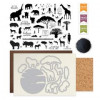
I'm here to share with you the June 2017 My Monthly Hero Kit from Hero Arts, but also my thoughts on the Ranger Tim Holtz Distress Oxide Inks. I know, I know, I'm late to the party, but just because I own a lot of inks, doesn't mean I use them that often. What d'ya do?
When I planned all of this out, I couldn't decide if I wanted Copic or Prismacolor so I decided to do both. Since I was going to do both, I figured why not Copic color on Neenah White Cardstock and do the Prismacolor on Strathmore Toned Tan Paper. I also really wanted to see how the Distress Oxide Inks would look on the different papers.
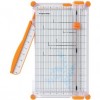
I trimmed both the Neenah and the Strathmore panels to 5"x7" this time peeps. On both of them, I used a T-Ruler and lightly traced the frame with a pencil.
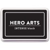
I stamped the tent from Go On A Safari Stamp Set by Hero Arts with Hero Arts Intense Black Ink on both panels. This stamp set is an add on for the MMH. I only used the one image, but the entire set is sooo cool.
Using the Fancy Die from the kit, I die cut 2 sheets of Inkadinkado Stamp Masking Paper. I kept both the positives and the negatives, because I will use both on both cards.
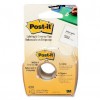
I placed the positive die cut mask on both panels to the left side. I used some Post-It Tape and masked the outside edges of the frame and I also made sure I masked off the lower half where the ground would be.
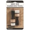
Starting from the top and using a Ranger Mini Ink Blending Tool, I blended Ranger Tim Holtz Distress Oxide Ink in Fired Brick, Spiced Marmalade and Fossilized Amber. I cannot say enough how over the moon I am for these inks folks. Stop me if you've heard this. They blend like butter. AH-maizing! I look forward to watercoloring with them. Truly.
At this point you can either let this air dry or set it with a heat tool. Either way, I highly recommend that you make sure it's good and dry before going any further. Ask me how I know. Oy. I almost ruined the Strathmore card because of this. I didn't, but boy there were almost tears people.
Anyway, after it's dry, remove the positive die cut and add the negative. You will be covering up the ink blending you just did, but exposing the blank space where the sun will be. Also be sure to mask off the ground area and outside the frame.
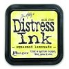
Again, I started from top to bottom and blended Distress Oxide Inks in Spiced Marmalade and Fossilized Amber. I needed a lighter yellow so I also blended Ranger Tim Holtz Distress Ink in Squeezed Lemonade. To match the texture and to lighten up my heavy handed application, I lightly went over the Squeezed Lemonade with Hero Arts Unicorn White Pigment Ink.
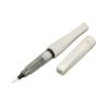
After both panels were dry. I went over the sun on both of them with Clear Wink of Stella. Then I masked of the top part of the panels and used Distress Oxide Ink in Walnut Stain and Vintage Photo. On both panels, I went way to dark so again I blended on some Hero Arts Unicorn White Pigment Ink.
Dry is the key word her ladies and gents. I made sure both were good and dry, then heat embossed my silhouette images with Versafine Onyx Black Ink and Hero Arts Clear Embossing Powder.
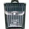
After all of the ink blending with the Distress Oxide Inks, I did have to go back with a Copic Multiliner and reinforce my black lines. I added a lil bit more Wink of Stella to the "grass" on the ground and called it a day.
That's it! These really were so easy to make folks. Promise.
As always, I hope you enjoyed my cards today and thanks so much for stopping in to see me!
Until next time!
Thursday, June 15, 2017












Gorgeous and thank you for sharing your tips. I look forward to playing with this set and my new oxide inks.
ReplyDelete